fbpx

Emma Coleman Skincare Brand Design

Emma Coleman Skincare Brand Design

Client:

Emma Coleman Skin

Type:

Brand and Packaging Design for Emma Coleman Natural Skincare
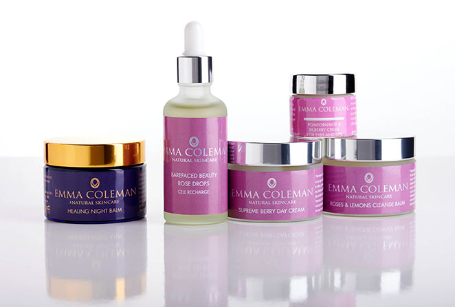
The project:

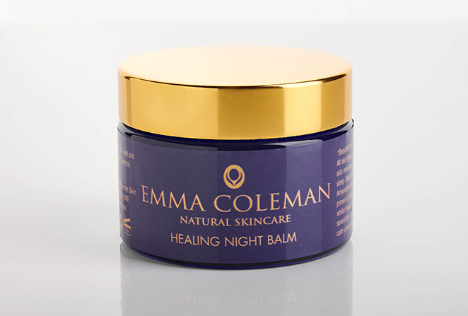
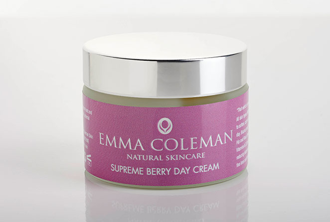
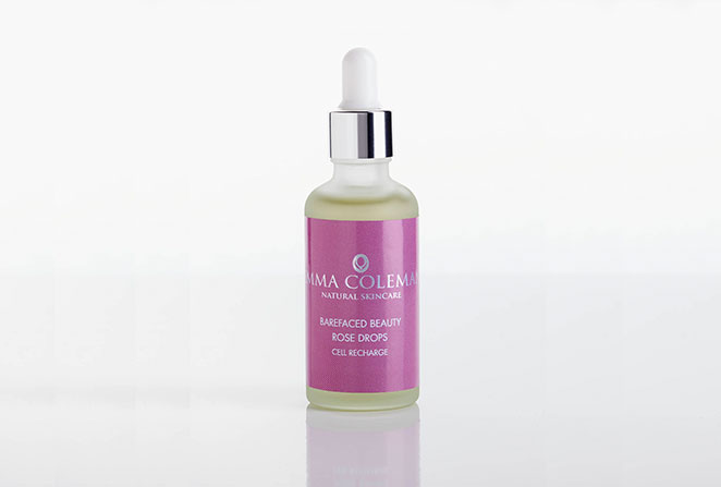
We designed premium and understated packaging for Emma Coleman’s award winning range of natural skincare products with a classic and understated look.

The brand logo that we designed for her represents both an abstract face soothed by caring hands and a budding flower signifying rejuvenation. The typographic treatment provides an elevated positioning for her brand.

The packaging was printed to replicate a foiled effect and complemented by understated and clinical typography.

Amino Snackfish

Client:
Seafisk

Type:
Brand identity and packaging design

The project:
Seafisk wanted to add a new product to their existing range of natural dried fish products from Iceland.

Aimed mainly at body builders and keep fit enthusiasts, the new product is a tasty “on the go” snack for any time of the day, full of protein and essential amino acids.

We designed a distinctive, modern and up to date, brand identity and packaging for this naturally cool dried cod snack, which also makes a tasty ingredient to soups and stews.

Amazonian Silk

Client:

SJS International

Type:

Brand Identity and Packaging
for Amazonian Silk Hair Extensions

The project:

SJS International are a new company providing quality hair products from the Amazonian Rain Forest. They came to us for packaging design and advice for their Amazonian Silk range of products.

Our packaging design provided a distinctive and relevant brand expression accross a range of products including hair extensions, hair closures and eyelashes.

The packaging utilises amazonian jungle leaf imagery and a distinctive colour pallette which communicates it’s unique proposition and sets it apart from the competition. Advanced print tecniques such as UV gloss varnish and foil blocking were used to enhance the product’s premium positioning.

The packaging was printed in China and the client’s Chinese printers were able to follow our artwork exactly.

We also produced launch posters, leaflets and business cards to assist in the launch of this product, which all utilise the same style – providing a strong and coherent brand expression.


Eco-Brush bamboo toothbrush

Client:

Eco-Brush Limited

Type:

Packaging Design

The project:

The manufacturers of Eco Brush asked us to produce the brand identity and packaging for their quality biodegradable toothbrush.

Both the product and it’s packaging are ecologically friendly. However, our client wanted to avoid an obvious ecological and earthy type design, but instead present the product with a more clinical and mainstream positioning.

We devised a distinctive logo and smart white gloss packaging featuring a window through which consumers can view the product.

As well as providing a strong brand identity – the packaging conveyed the company’s mission – to reduce the use of plastic toothbrushes and plastic pollution.

The brand logo was laser etched onto the bamboo brush providing important branding to the product once the box is disposed of.

Inner-Soul Bespoke Consultation Pack

Inner-Soul Bespoke Consultation Pack

Client:
Inner-Soul Organics

Type:
Bespoke Consultation Pack

The project:
Inner-Soul produce a wonderful range of essential oils

This consultation pack provides the customer with the opportunity for a bespoke oil specifically for their own requirements and skin type.

It comes complete with a bottle of bespoke oil produced especially for them.

Inner-Soul Mum and Babe Products

Inner-Soul Mum and Babe Products

Client:
Inner-Soul Organics

Type:
Brand extension

The project:
Inner-Soul are slowly adding new products to their wonderful range of essential oils and we designed the packaging for their Mum and Babe range.

The two products are an All Over Skin Oil and a Special Breast Soothing Oil.

Both are specially developed for nursing mum’s and the ingredients are organic like all of Inner-Soul’s products.

Inner-Soul

Inner-Soul

Client:

Inner-Soul

Type:

Brand identity

The project:

Inner-Soul wanted a fresh look to their new range of essential oils and skin care.

The core theme to the brand identity that we created utilises a radiating device as part of the logo and a distinctive mark on the packaging range.

Understated typography and a fresh colour palette provide a modern and up to date positioning as well as conveying the gentle and soothing nature of the products.

The Little Red Box of Cheese

Client:

Westbury Cheese Company

Type:

Brand Identity and Packaging Design

The project:

Our brand identity and packaging design for The Little Red Box of Cheese helped our client give consumers everything they need for the perfect ‘on-the-go’ lunch.

The packaging folds out into a plate and and contains a selection of 3 cheeses, 8 oat-cakes, caramelised onion chutney, hand-wipe and knife.

As well as producing the packaging design, we also developed the ‘shelf ready’ packaging for this award winning product.

Awards:
Winner of the 2011 Nantwich International Cheese Awards for Branded New Retail Innovation.

2011 Gold Award for Cheese Snacks – Frome Global Cheese Awards.

Fabulous 4

Fabulous 4

Client:

Bongrain ULN

Type:

Brand Identity and Packaging

The project:

Bongrain ULN required packaging for their premium cheese selection pack produced by their Westbury Cheese Company brand.

The pack was to contain their premium branded cheeses – Saint Agur blue cheese, Le Rustique brie as well as Colliers mature cheddar and Wensleydale with cranberries.

To differentiate these classic cheeses from other more ‘run of the mill’ selection packs, we developed the brand name – Fabulous 4 and designed premium packaging that successfully incorporated the brand logos as well as communcating the nuances of the various cheeses.

Erasmic Shaving Foam


Client:

Keyline Brands

Type:

Brand Identity and Packaging

The project:

Our proposals for the packaging redesign of Erasmic were masculine, modern and stylish.

Featuring a distinctive circular device with a nick cut out to symbolise the quality of shave.

The brand logo utilised the same feature on a matt silver background providing a simple but elevated expression.